Wednesday, February 24, 2010

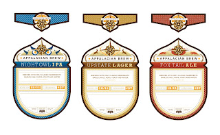
APPALACIAN BREW


These are some labels for Appalacian Brew. A refined craft beer company with a focus on quality, natural ingredients, and the great outdoors.

I chose a pint sized beer bottle to put these labels on, almost looks like a miniature wine bottle and I feel it looks elegant. I have noticed that a few top-end beers come packaged in 4 packs, instead of 6, and I think that this the approach I am going to take.

Tuesday, February 23, 2010

Tuesday, February 9, 2010

Second Draft, On The Rise


I have remade the title for "On The Rise". This is an idea for a movie poster, and is still in progress.

TYPE:
I started out with the typeface, Bureau Agency - Bold, then altered it by making it appear on a slant to help portray a rise. I also added dimensionality to the type. It took a very long time to make this title, lots of playing with anchor points and such. I feel that it is a major improvement from last week, what do you think?

DETAIL:
Here are some bigger screenshot's so you can see the details on the type! Another color also!

First Draft, On The Rise